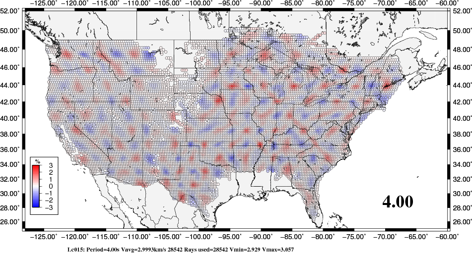
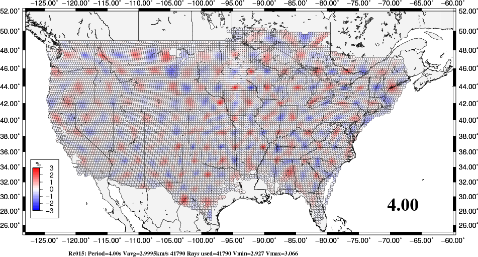
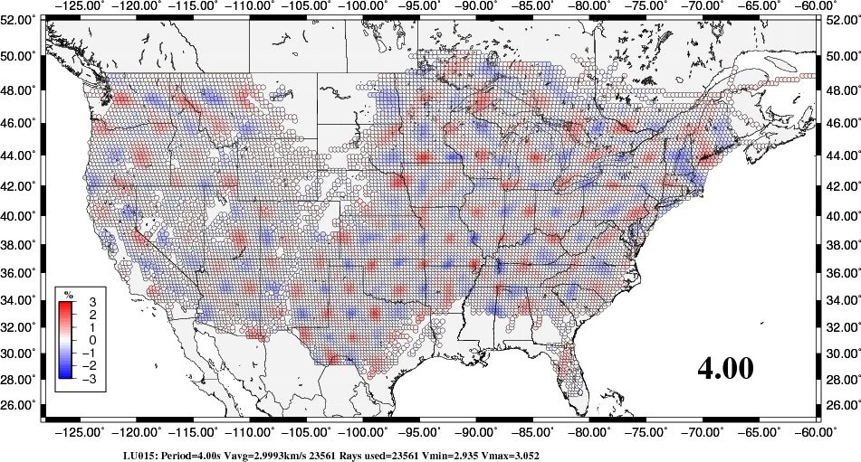
Each of the directories will have maps showing the spatial variation of the dispersion for each period. Then there will be a LOVEc/LTOMO015/Lc015.png which shows the Love wave phase velocity for a period of 4.0 sec. The association between period and the ID 015 is given in the file LOVEc/per.uniq.NUM. These files are used to make the GIF movies and serve to give some insight on the lateral variation of structure.
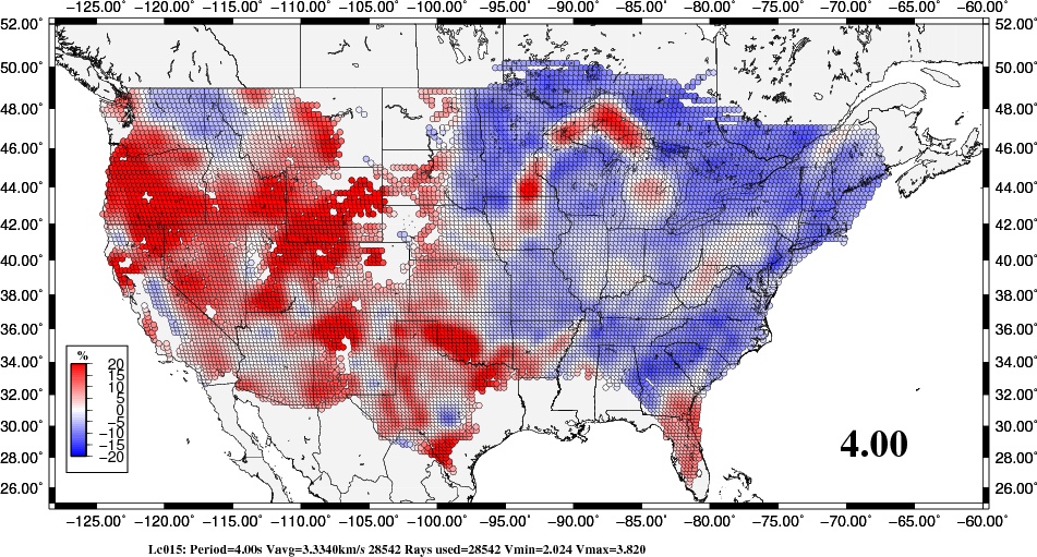
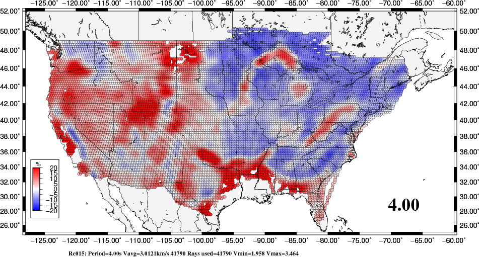
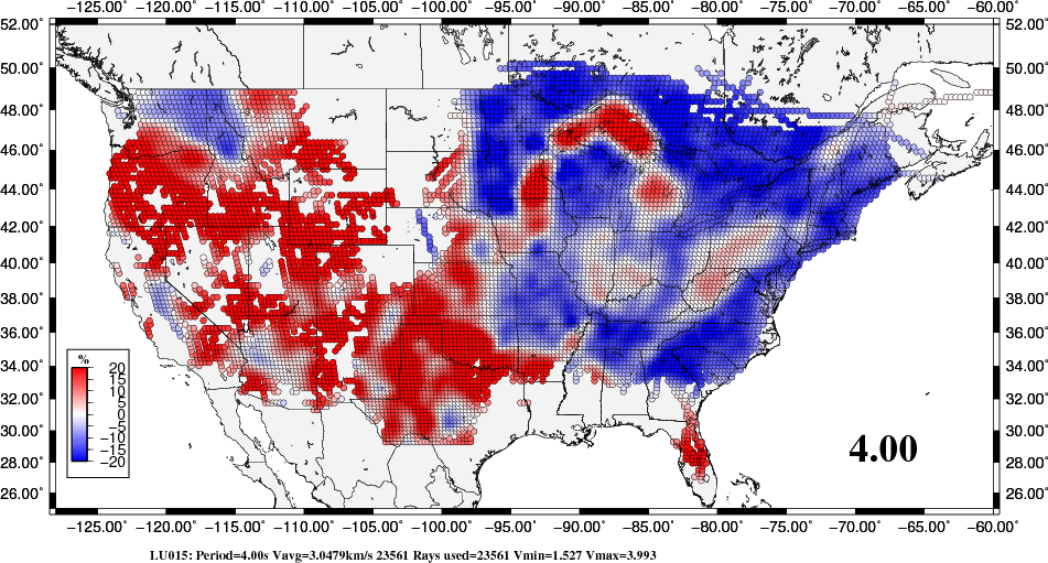
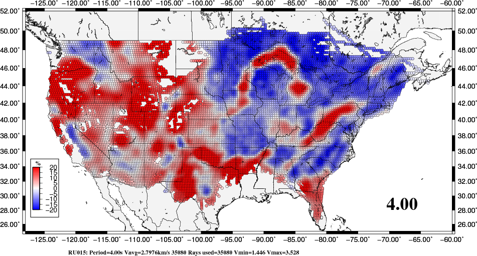
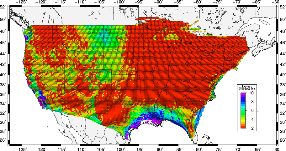
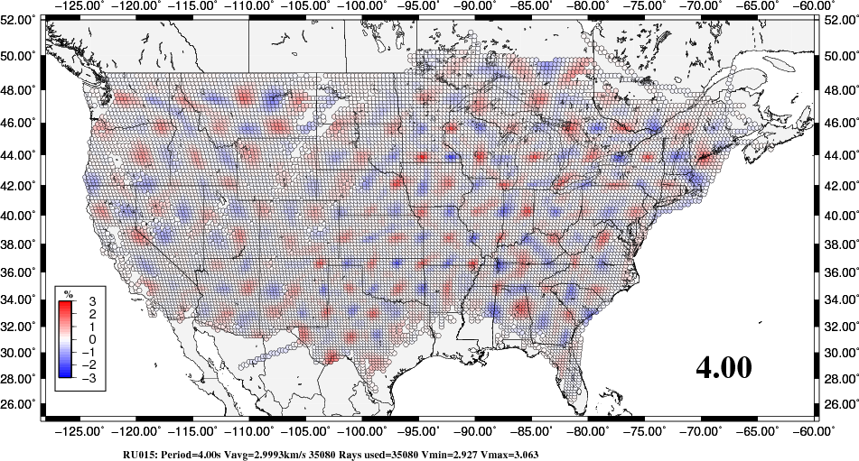
An example of the dispersion results at a period of 4.0 seconds is shown in the next figure.
|
|
|
|
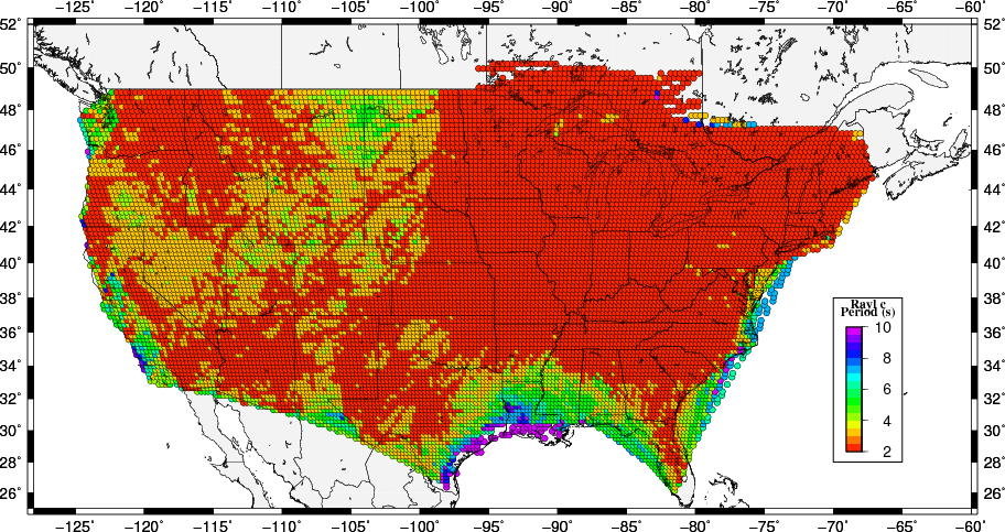
In these figures, the white areas are just to not have any valid dispersion results. This is a hardwired property of the program doquad which requires at least 50 km or ray paths within each 25 km x 25 km tomography cell.
One also sees that the variation in group velocity is greater than that of the phase velocity, in part because the group velocity is derived from a derivative of the phase velocity. Even though the results are not complete across the map area, some geological structures are imaged: the Mid-Continent Rift, the Michigan Basin, the Illinois Basin, the Cincinnati Arch, the Mississippi Embayment, the Llano Uplift in Texas, and the Anandarko Basin in Oklahoma. Thus the images at a 4 second period are capturing shallow geology.
Shorter periods would better relate to shallow geology, but as seen in the discussion of the shortest observed period below, the maps will not be as complete.
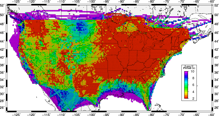
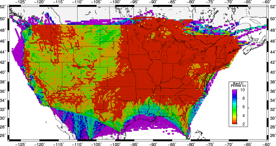
It is well know that the minimum period observed in earthquake data is a function of source depth because of the relationship between depth and excitation. For ambient noise, the empirical observation is that sometimes short periods are observed and many times they are not. This difference may be a function of distance from noise sources and also upper crustal structure. The next set of images examines the tomography results as a function of period and notes the shortest period for which the sum of ray paths through a tomography cell exceeds 50 km, which was the criteria for accepting the tomography results.
In each of these directories there is a file that indicates the shortest useful period in the tomography results, e.g., Lc_1stper.png, LU_1stper.png, Rc_1stper.png or RU_1stper.png. The following images show the result of this examination. The surprising point is that short periods are not observed along the Gulf Coast where the noise sources should be high, indicating that structure may be a controlling factor there. The lack of short period observations at the western part of the maps may indicate the effect of distance from noise sources in addition to sensitivity to upper crustal structure.
Because the group velocity data set is dominated by ambient noise observations, and since the phase velocities are based only on ambient noise, these maps indicate the usefulness of the ambient noise technique at shorter periods.
 |
 |
 |
 |
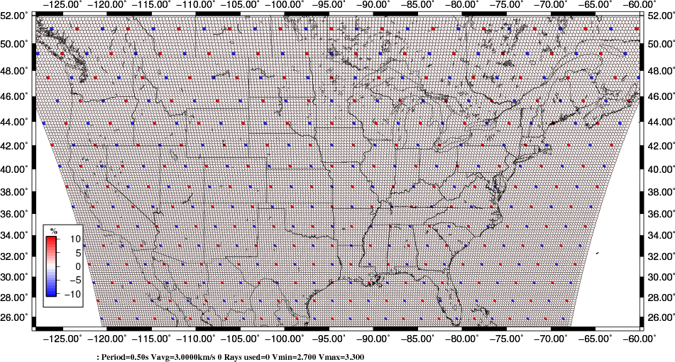
In lieu of a determination of the standard error of the dispersion in each cell, we created a spike map, consisting of a uniform dispersion if 3.0 km/s everywhere except at points at the corners of a 200 km x 200 km grid, where the velocities were alternately 2.7 and 3.3 km/s. Next for each observation, rays were traced through the grid to compute travel times and hence the path group velocities where were then used as input to the tomography code. This test is similar to the checkerboard test, but the recovery of the spikes is an indication of the spatial smoothing inherent in the inversion. This an indication of the best that the inversion can produce. However data variability will lead to reduced resolution.
The spike test is performed in the directories LOVEc.spk, LOVEU.spk, RAYLc.spk and RAYLU.spk
The test grid image is found at LOVEc.spk/LTOMOSPK/Lcspk.png, LOVEU.spk/LTOMOSPK/LUspk.png, RAYLc.spk/RTOMOSPK/Rcspk.png and RAYLU.spk/RTOMOSPK/RUspk.png, and is shown in the next figure.
 |
An example of the dispersion results at a period of 4.0 seconds is shown in the next figure.
 |
 |
 |
 |
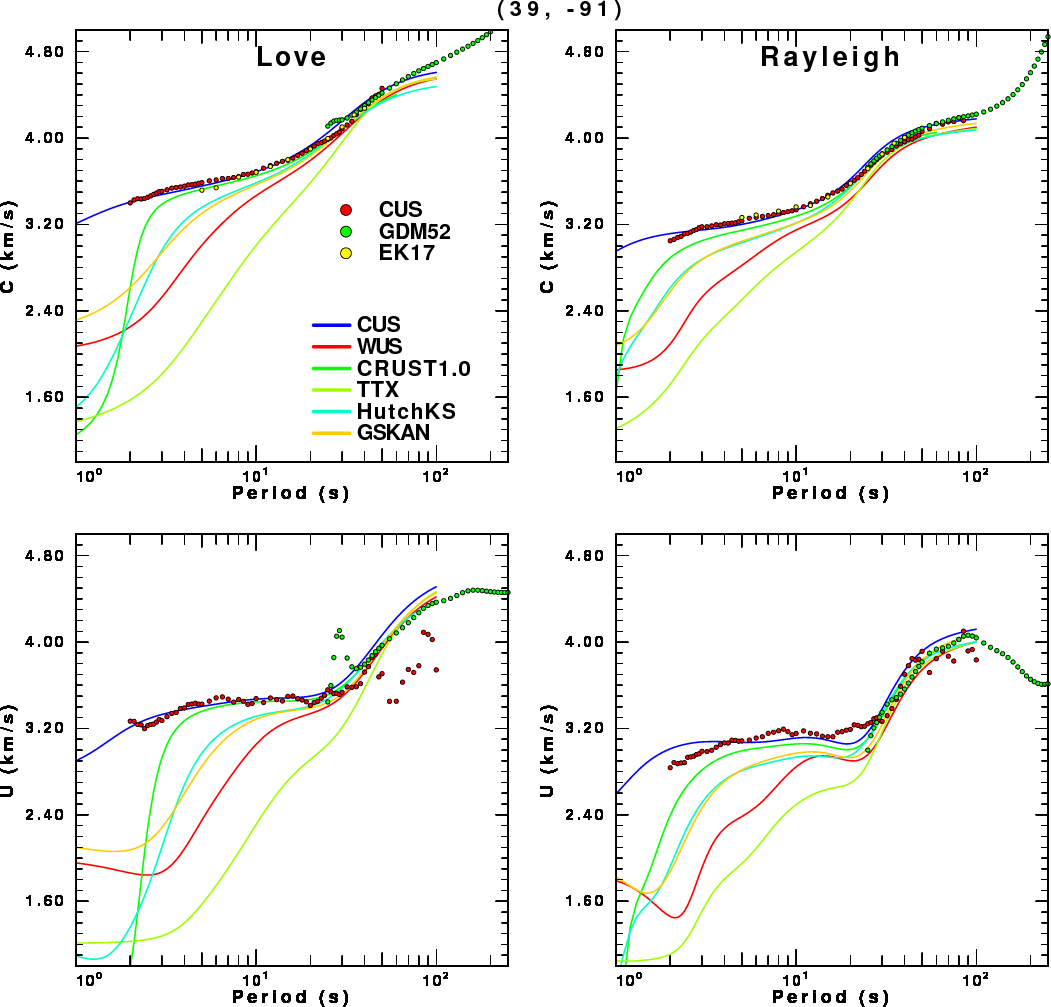
When nn earthquake occurs in a new area, the choice of the local velocity model for analysis is problematic. Such a velocity model can be used for location or for modeling of the long period waveforms. Waveform modeling for regional moment tensor inversion typically focuses on the fundamental mode surface wave since that it the largest signal at longer periods. This inversion had problems if the Green's functions do not match the character of the observed signal. Since that signal is inverted in the time domain, the signal is best described by the group velocity. Thus a comparison of the tomographic dispersion and model predicted dispersion at a given source region is a useful tool.
This comparison is implemented using the program doquad and the shell script FDODISP. Assuming that one is in the SLU.CUS directory, do the following:
cd nGRIDREGION
FDODISP 39 -91
FDODISP used doquad to interpolate the tomography results for this coordinate. It also gets the Ekstrom (2011,2017) tomography results and theoretical dispersion predictions for the CUS, WUS, TTX, HutchKS, GSKAN generic models and the CRUST1.0 model for this coordinate. The output of this script consists of the following:
tomocus.disp     [Dispersion in surf96 format from the CUS tomography]
tomoek.disp      [Dispersion in surf96 format from the Ekstrom 2017 tomography]
tomogdm52.disp   [Dispersion in surf96 format from the Ekstrom GDM52  tomography]
all.disp         [Combined set of all observed dispersion in surf96 format]
all.PLT          [figure in Computer Programs in Seismology CALPLOT format]
all.eps          [EPS of the figure]
all.png          [PNG of the figure created from the EPS using ImageMagick]
The all.disp can be used in the Computer Programs in Seismology codes to invert for structure. The resultant figure is shown in the next figure.
 |
In the nGRIDREGION there is a shell script to create the dispersion images on a grid for the entire study area. This was used to be to interactively select a dispersion observation by clicking on a map.
Here we use the program ctou96 to check the consistency of the independent phase and group velocity inversions. The output of ctou96 is a set of least squares estimates of the dispersion at the same periods as the input dispersion. One may be tempted to used these spline predictions for later inversion, but one must be careful about the output of a spline fit.
The implementation of this code is built into the FDODISPspline shell script in the nGRIDREGION subdirectory. For the CUS data set, the input to ctou96 consists of the CUS, EK17 and GDM52 tomography estimates, which are concatenated into the file all.disp. The links in the table show the output of the FDODISPspline script.
| Command | Image link |
|---|---|
FDODISPspline 39 -91 |
39.-91.png |
FDODISPspline 39 -81 |
39.-81.png |
FDODISPspline 34 -99 |
34.-99.png |
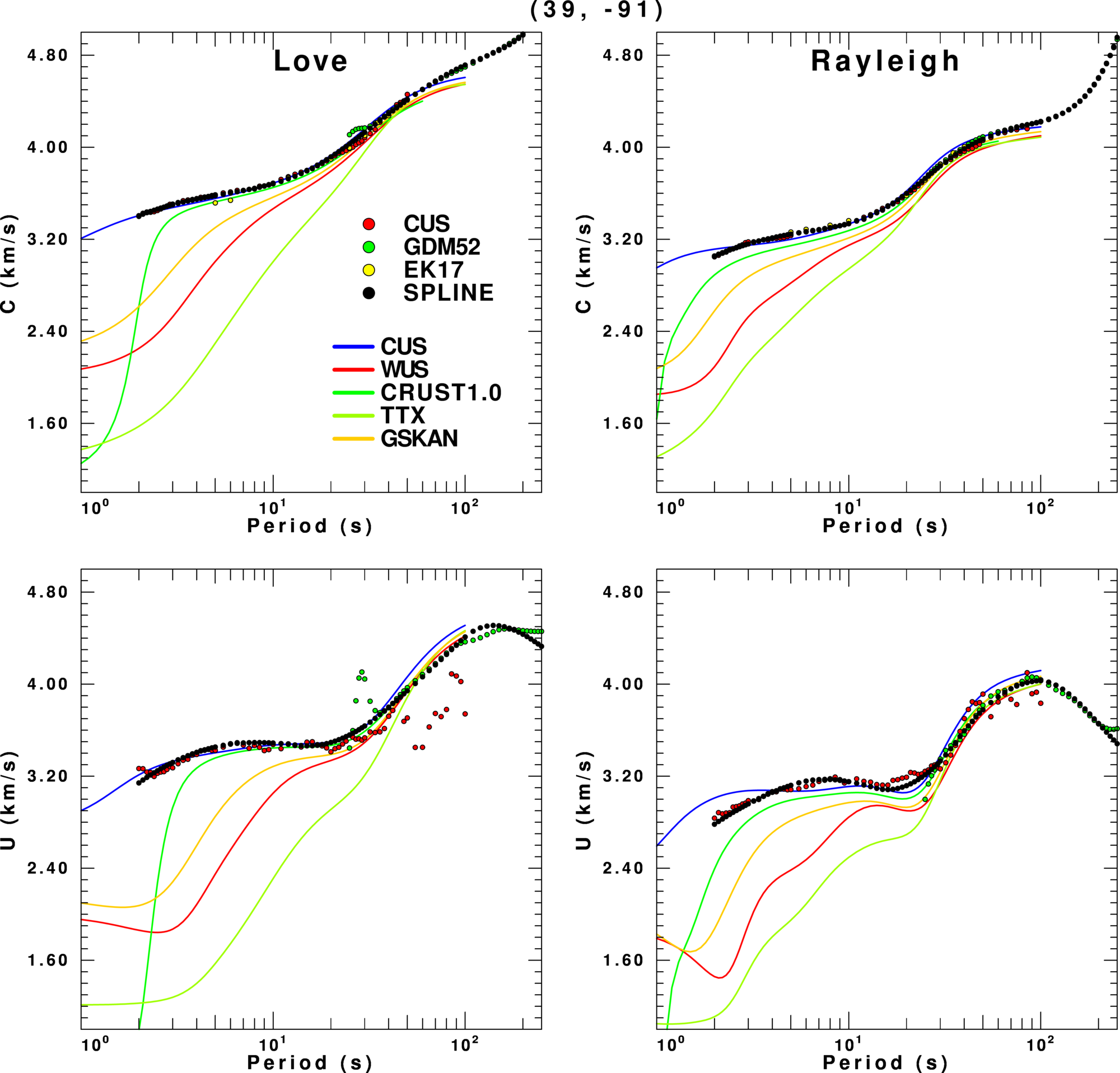
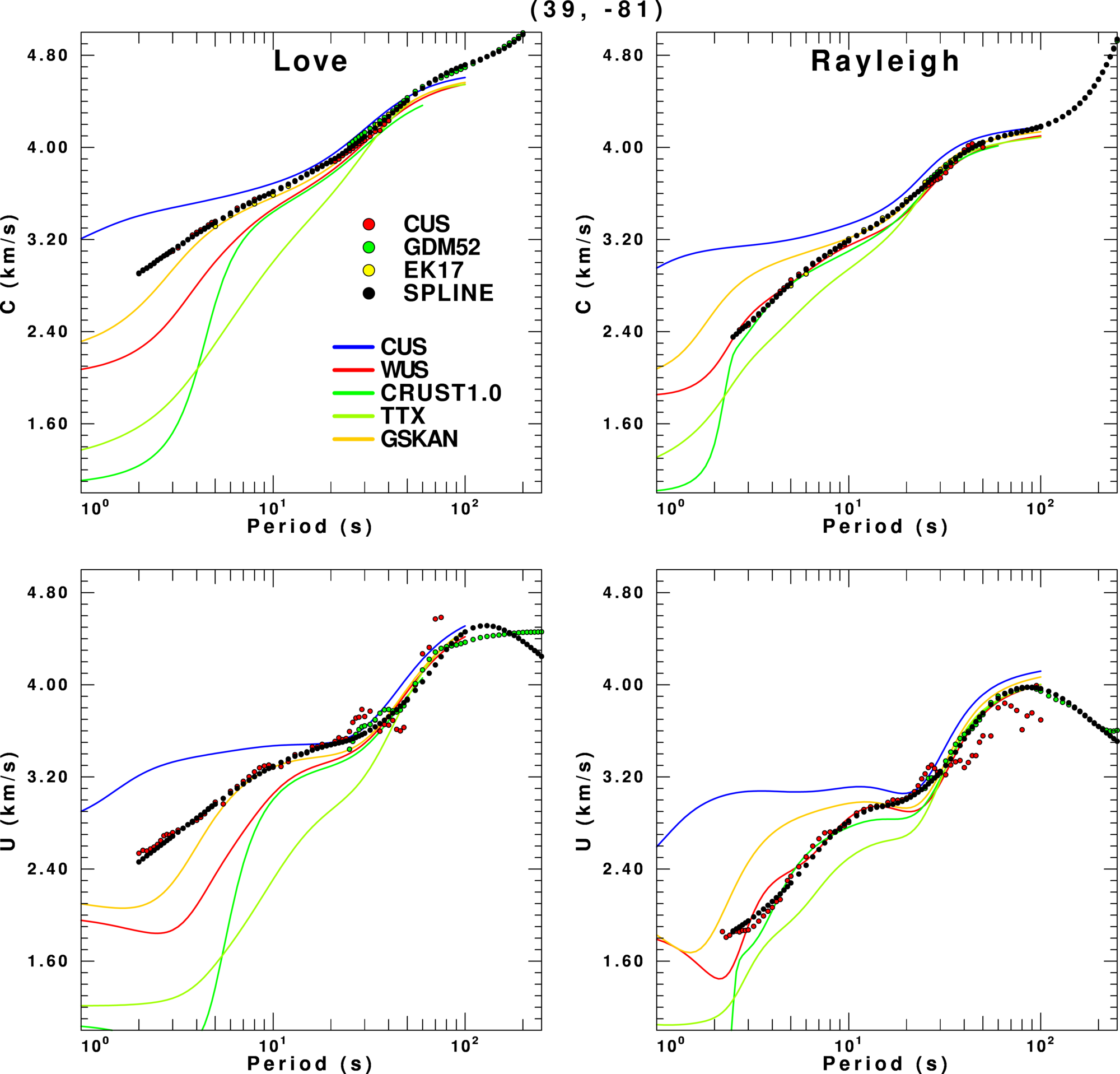
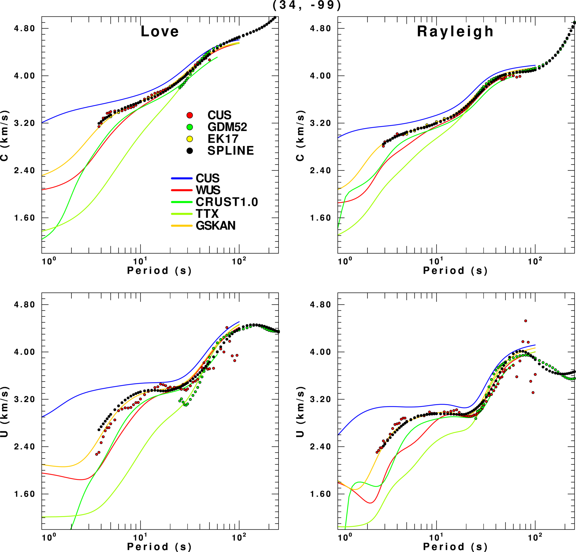
In these figures the left column is for the fundamental model Love wave and the right for the Rayleigh wave. The top row gives the phase velocity and the lower the group velocity. The observations and spline estimates are given by the colored circles. For reference various are given.
The first coordinate is near St. Louis, Missouri, USA, and the CUS model best fits the dispersion. Here is in the other figures, the spline technique has difficulty with long period group velocities. We also see that the GDM52 Love wave group velocity has problems at short periods. Finally CRUST1.0 is not very good at predicting the dispersion at the shortest periods, which is most likely due to the use of a very low shear-wave velocity in the top layer of the model.
The second coordinate, (39, -81) is in West Virginia. While CRUST1.0 does well for the Rayleigh waves, it is not very good or the Love waves. The fact that the WUS model fits the Rayleigh waves and does not fit the Love waves may means that the assumption of an isotropic model does not apply here.
The last example is for (34,-99) which is on the Texas - Oklahoma border. The first think to note is that the observed Love wave group velocities of this study (CUS) are noisy. They also seem to inconsistent with th phase velocities, e.g., the spline prediction. We again see that GDM52 has problems with the Love wave group velocities. We again see that there are differences between model predictions and observed dispersion for many of the models.
Given what we have seen, e.g., the lack of scatter in the phase velocities compared to the group velocities, an inversion might weight the phase velocity greater than the group velocity values.
It is obvious from the previous example that some velocity models are better than others in describing the observed dispersion. It is often useful to glance at a map to select a velocity model. This is possible with the dispersion results by computing the standard deviation between observed and predicted dispersion for each of the models. In the example below, only the SLU tomography results are used. One problem is that observed dispersion varies geographically, as shown in the shortest period plots at the top of this page. This means that the metric is not uniform across the study area.
The next figure selects the model that best fits the observed dispersion from a choice of the CUS, WUS or TTX models on the left, or from the CUS, WUS, TTX and Crust1.0 models in the right. The color indicates the model, while the size of the symbol indicates the RMS.
| CUS,WUS,TX | Crust1.0,CUS,WUS,TTX |
|---|---|
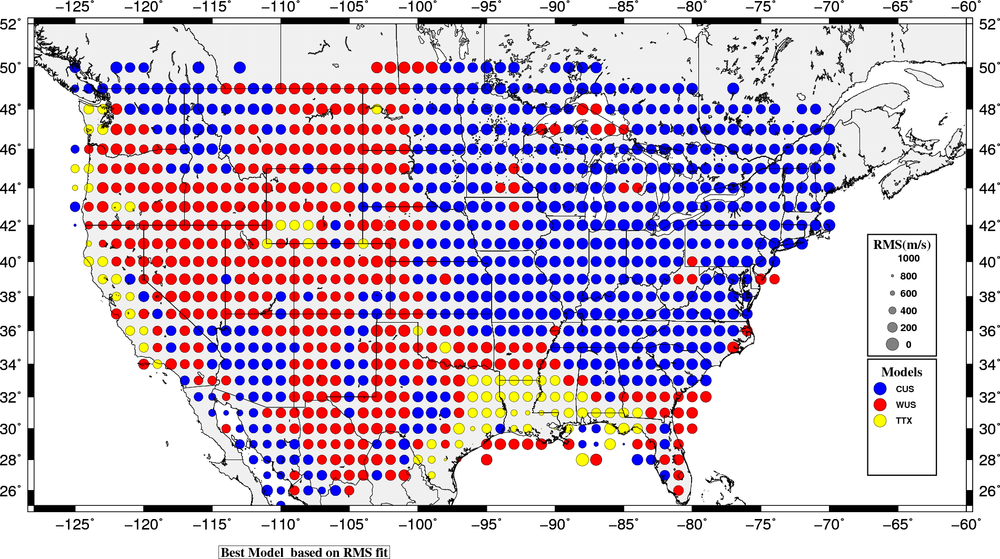 |
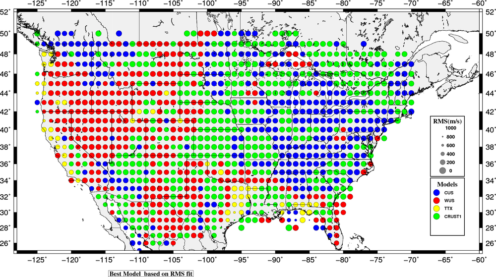
|
An alternative approach is focus on how well a given model fits the dispersion. n this figure the size of the symbol and the color indicate the goodness of fit: red and large indicates a good fit.
CUS Model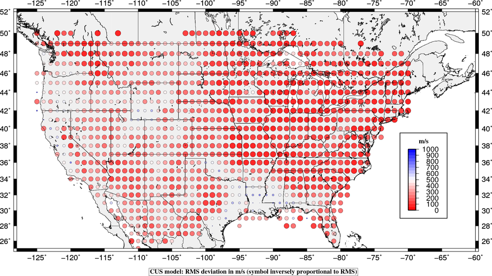
|
WUS Model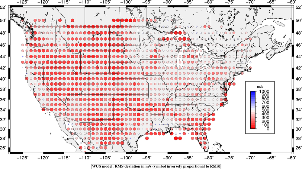
|
TTX Model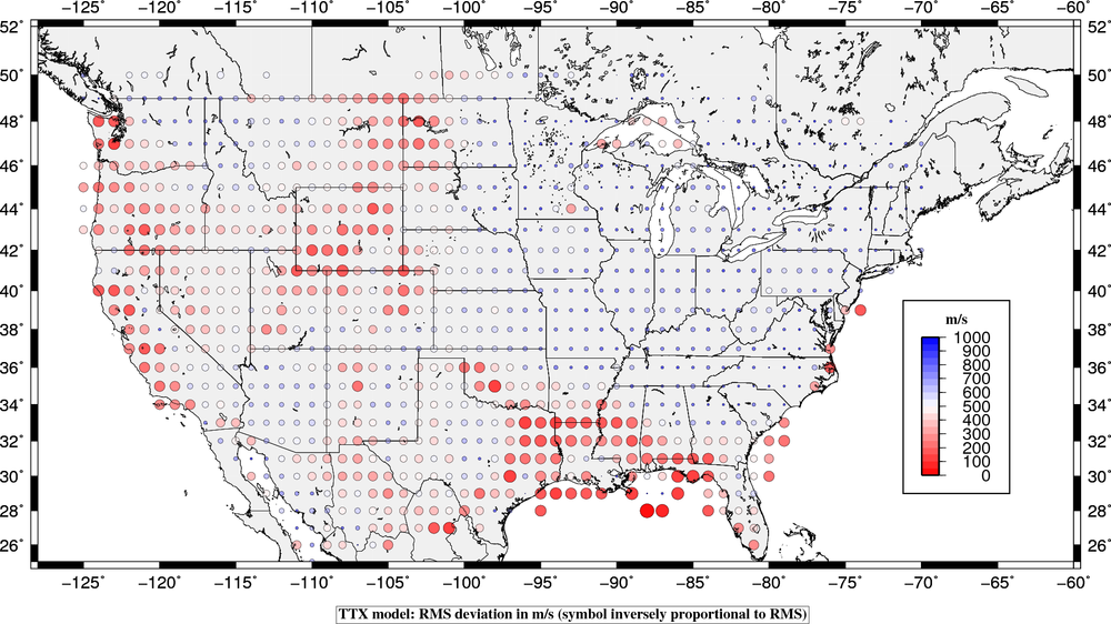
|
CRUST1 Model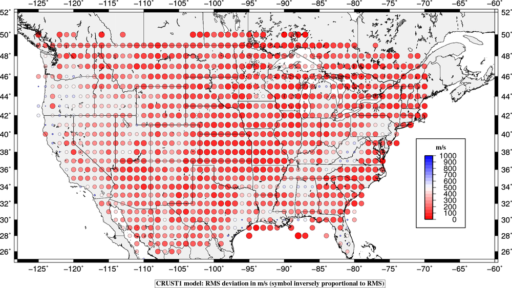
|