http://www.eas.slu.edu/eqc/eqc_research/NATOMO/NATOMO1/index.html focuses on a comparison of current tomography results with independent results from Lamont for long periods and Lamont for the intermediate periods. There was a cursory comparison of dispersion curves at selected locations.
Upon clicking on a point, you will see the Love and Rayleigh group velocity dispersion curves with the following key:
Because the tomography code computes the continental average group velocity at each period, and then solves for deviations this background level, inversion cells with no rays will yield this average velocity by default. This result is not real, since there were no observations in the cell, and thus must not be used. To create a set of dispersion curves for a given map coordinate, the cells which surround the desired point are examined as well as the summation of ray paths through each cell. Currently, a dispersion is provided for the desired point only if the sum of ray paths through these neighboring cells is as least 50 km. If this condition is met, then the dispersion is computed using an interpolation of the values at the adjacent nodes.
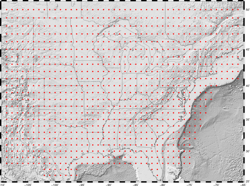
NOTE ON THE MAP: This map gives the dispersion at a given geographic latitude/longitude coordinate.
The links below point to the dispersion map. Note these links open a new browser window, not to annoy you, but to permit a side-by-side comparison of the dispersion curve and the resolution map.
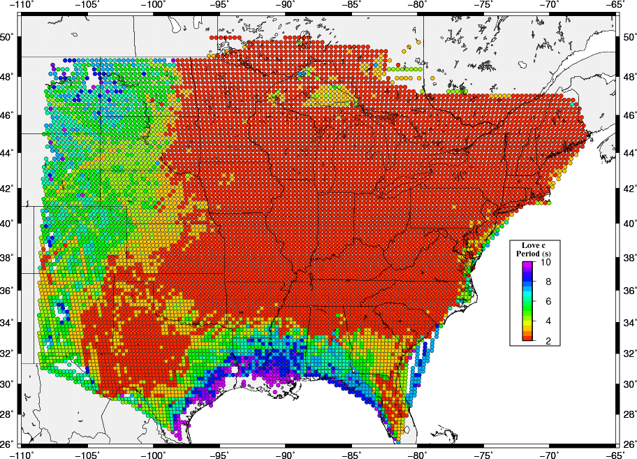
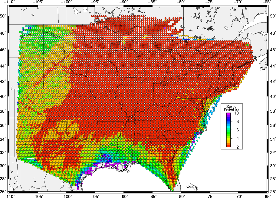
Shaded circles are used to indicate percentage velocity variation from the average of all values in the map. Regions without shaded circles do not have enough rays passing through the 25 km x 25 km tomography cell. To be specific, tomography computations save the total number of kilometers of rays passing through a cell. The tomography applies a Gaussian spatial smoother. If there are no rays through a cell, the cell dispersion is set to the mean of all observations at a given period. Thus each cell has a dispersion value. We choose to require at least 50 km of cumulative ray path through a cell to say that the dispersion value is defined by data. At short and long periods, only part of the study region is covered by symbols. At intermediate periods, there is good coverage. The reason for this discrepancy is that the dispersion could not be measured at the short and long periods because of the filtering effects of earthquake source depth and the generation of noise for the empirical Green function data sets.
At the bottom of each figure there is a comment line of the form:
Lc000: Period=2.00s Vavg=3.4013km/s 2126 Rays used=2126 Vmin=2.747 Vmax=3.734

Lc000  Love wave, phase velocity. an R is used for Rayleigh wave and an U is used for group velocity, e.g.,
       RU040
Period This is the period of the map
Vavg   Mean dispersion velocity for the map. The color shading are percentages of this value
Rays   The total number of paths between source/receiver for this period.
Vmin   Lowest dispersion value in a cell on the map
Vmax   Highest dispersion value in a cell on the map
Finally, this map was created by searching for sources and receivers within the bounds of the map. On the western edge, this means that important paths to to the west were excluded, which is one reason for the missing cells there. These cells are on the CUS map.
NOTE ON THE MAPS THAT FOLLOW: The legal boundaries and topography are in geographic (geodetic) coordinates. However the values shown are directly from the tomography grid and are in geocentric coordinates. Thus some of the tomography cells may be mislocated in a north-south direction with respect to the underlying map
| Dispersion Maps | |||
| Love Phase Velocity | Love Group Velocity | Rayleigh Phase Velocity | Rayleigh Group Velocity |
| 3 sec | 3 sec | 3 sec | 3 sec |
| 4 sec | 4 sec | 4 sec | 4 sec |
| 6 sec | 6 sec | 6 sec | 6 sec |
| 8 sec | 8 sec | 8 sec | 8 sec |
| 10 sec | 10 sec | 10 sec | 10 sec |
| 20 sec | 20 sec | 20 sec | 20 sec |
| 30 sec | 30 sec | 30 sec | 30 sec |
| 40 sec | 40 sec | 40 sec | 40 sec |
| 50 sec | 50 sec | 50 sec | 50 sec |
| 60 sec | 60 sec | 60 sec | 60 sec |
| 70 sec | 70 sec | 70 sec | 70 sec |
| 80 sec | 80 sec | 80 sec | 80 sec |
| 90 sec | 90 sec | 90 sec | |
| 100 sec | 100 sec | 100 sec |
In lieu of a determination of the standard error of the dispersion in each cell, we created a spike map, consisting of a uniform dispersion if 3.0 km/s everywhere except at points at the corners of a 200 km x 200 km grid, where the velocities were alternately 2.7 and 3.3 km/s. Next for each observation, rays were traced through the grid to compute travel times and hence the path group velocities where were then used as input to the tomography code. This test is similar to the checkerboard test, but the recovery of the spikes is an indication of the spatial smoothing inherent in the inversion. This an indication of the best that the inversion can produce. However data variability will lead to reduced resolution. The test grid is shown in the next figure.
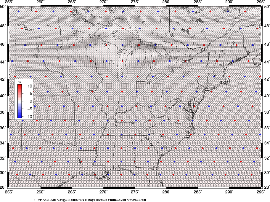 |
The inversion code has two set parameters - one that controls the amount of spatial smoothing and the other than ensures the invertibility of the large system matrix.
| Dispersion Spike | |||
| Love Phase Velocity | Love Group Velocity | Rayleigh Phase Velocity | Rayleigh Group Velocity |
| 3 sec | 3 sec | 3 sec | 3 sec |
| 4 sec | 4 sec | 4 sec | 4 sec |
| 6 sec | 6 sec | 6 sec | 6 sec |
| 8 sec | 8 sec | 8 sec | 8 sec |
| 10 sec | 10 sec | 10 sec | 10 sec |
| 20 sec | 20 sec | 20 sec | 20 sec |
| 30 sec | 30 sec | 30 sec | 30 sec |
| 40 sec | 40 sec | 40 sec | 40 sec |
| 50 sec | 50 sec | 50 sec | 50 sec |
| 60 sec | 60 sec | 60 sec | 60 sec |
| 70 sec | 70 sec | 70 sec | 70 sec |
| 80 sec | 80 sec | 80 sec | 80 sec |
| 90 sec | 90 sec | 90 sec | |
| 100 sec | 100 sec | 100 sec |
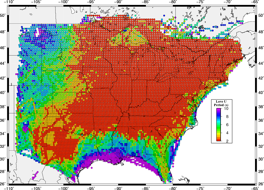
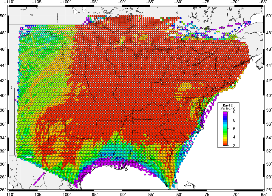
The following images show the result of this examination. The surprising point is that short periods are not observed along the Gulf Coast where the noise sources should be high, indicating that structure may be a controlloing factor there. The lack of short period observations at the western part of the maps may indicate the effect of distance from noise sources in addition to sensitivity to upper crustal structure.
Because the group velocity data set is dominated by ambient nosie observations, and since the phase velocities are based only on ambient noise, these maps indicate the usefulness of the ambient nosie technique at shorter periods.
 |
 |
 |
 |